New Delhi, January 2026.
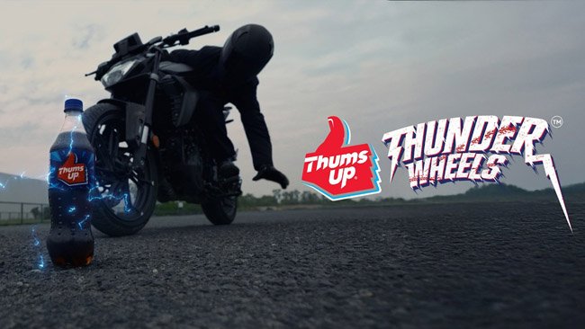
Thums Up, India’s homegrown cola giant,has
one of themost recognizable logos. Today, the brand unveiled a new identity
that signals a strategic shift, reflecting a new India defined by ambition,
confidence, and a drive to maximize every moment.
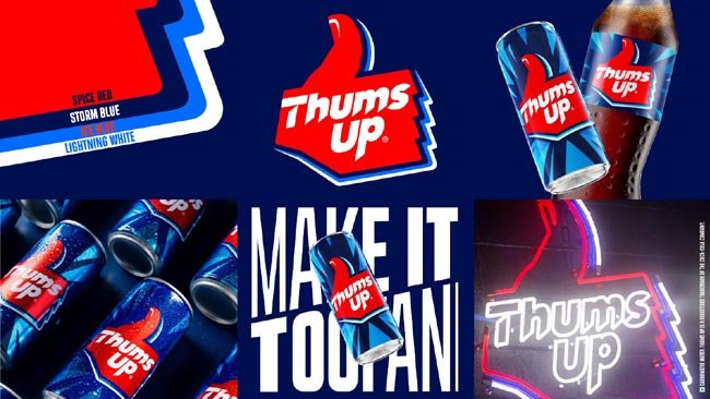
Thums Up’s in-house design team has
developed this rebrand in partnership with the design agency SUPERULTRARARE®. The new
identity marks Thums Up’s first major visual evolution in over
2 decades. Built on strong legacy and crafted for the future, the refreshed
look ushers in a more dynamic and explosive visual world
for the cola. Its trademark logo carries powerful memory structures and had
been refreshed only three times since its inception. Each evolution has reflected
the changing codes of youth culture and the evolving spirit of young India.
The new brand world strikes a perfect balance
of retaining the impact and strength of Thums Up’s distinctive assetsandintroducing
aprogressive and contemporary vibe. The typography is sharper and more
chiseled. The trio-color palette ofspiced red, iced
blue, and storm blue draws from the brand’s rich heritage, symbolizing
strong taste, thunderous refreshment, and an adventurous personality. Dynamic detailing
preserves thehuman touch of the thumb-mark, reinforcing the brand’s enduring
spirit. The new visual identity reflects how today’s youth feel -confident,
challenging the ‘ordinary’, and unlocking bold new experiences everyday. The
logo has also been optimized for future, with consistency across screens, and
stronger impact across retail shelves.
Sumeli
Chatterjee, Senior Director, Sparkling Flavours, Coca-Cola India and Southwest
Asia excitedly added, “For nearly five decades,
Thums Up has been a defining force in youth culture representing bold and relentless
confidence with an unmistakably ‘toofani’ spirit. Its iconic‘TasteTheThunder’
line, strong taste, and adventurous communication have inspired generations,
making it the drink of choice of young India. The new Thums Up visual identity
is a strategic step forward that reinforces our cultural relevance as we unlock
the next phase of growthand make the brand world more dynamic, distinctive and exciting
for the future.”
Matthew Kenyon,
Founder, The SUPERULTRARARE®elaborated,“We set out to
distill the core essence of what Thums Up represents and what emerged was a
powerful cultural signal - strong, resilient, and iconic…just ready for the
present. Building on this, we sharpened the identity by preserving what
consumers love while amplifying what lies ahead - resulting in a bolder,
clearer expression designed for today’s Indian youth.”
Launched in 1977
as India’s first homegrown cola, Thums Up has reshaped the category with its
bold spicy taste and sharp positioning among adventurous Indian youth. Thums Up
is not just seen; it is felt and lived through experiences. Over the years, its
Toofani spirit has come alive through iconic campaigns from #TasteTheThunder
and #AajKuchToofaniKarteHain to #PalatDe and #SoftNahinToofan, always inspiring
the youth across generations. Last year, the brand launched Thums
Up XForce as an All Thunder, No Sugar offering that offers the signature
bold taste sanssugar. Thums Up XForce has established
itself as the largest No-Sugar drink in just six months of its launch.
As Thums Up looks
forward to the future, the new visual identity sharpens a brand that
has grooved with the times, setting the stage for the next
chapter and continuing to be unapologetically Toofani.
© 2019 All Rights Reserved | democraticjagat2019 | Developed By DIIT IT SERVICES & SOLUTIONS